This site is all about how modern clothing brands use typography to enhance sales and connect more with their audience.
My website name
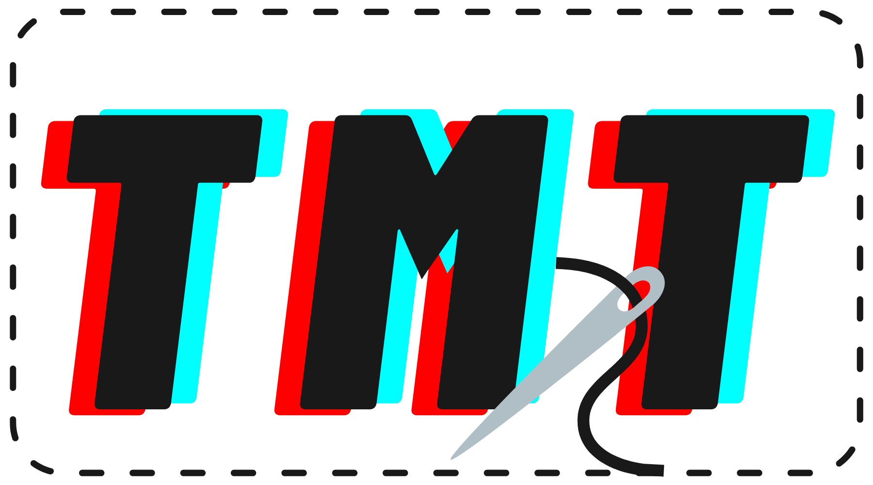
I decided to call my website ‘Tailor-Made Typography’ because ‘Tailor-Made’ is a term used when describing clothing and my whole site centres around clothing brands and the typography they use.
My logo and banner image

I decided to use a colourful, modern font that resembles the clothing brands that I analyse in my blog. The 3D effect in the words ‘Tailor-Made’ give a very futuristic, modern feel and the overlapping contrasting font ‘Typography’ gives it an ‘imperfect’ feel- a common design technique used in alot of modern clothing brands.
The letters of ‘Tailor-Made’ are bold and thick, making it stand out and become easily recognisable. I wanted the brand to feel unisex to keep up with modern trends, so I chose my main colours to be something that everyone would like (red, turquoise and black).
The fonts I used are ‘Planet Arcadia’ for ‘Tailor-Made’ and ‘Stay Fearless’ for ‘Typography’. Both can be found on Canva.

I wanted to keep my logo fairly simple and easily recognisable. My intended audience are young adults/teenagers so I wanted to keep the 3D letters in my logo to keep the modern feel, which would appeal to young people. The black dotted outline represents stitches and I included a sewing needle to give a hint to the reader that my blog is about clothes.
I also wanted to keep a fairly minimalistic colour palette for the rest of my site, with all pictures shown on the main page of my website having a white background. This is a modern trend which is why I thought it would fit my site well.